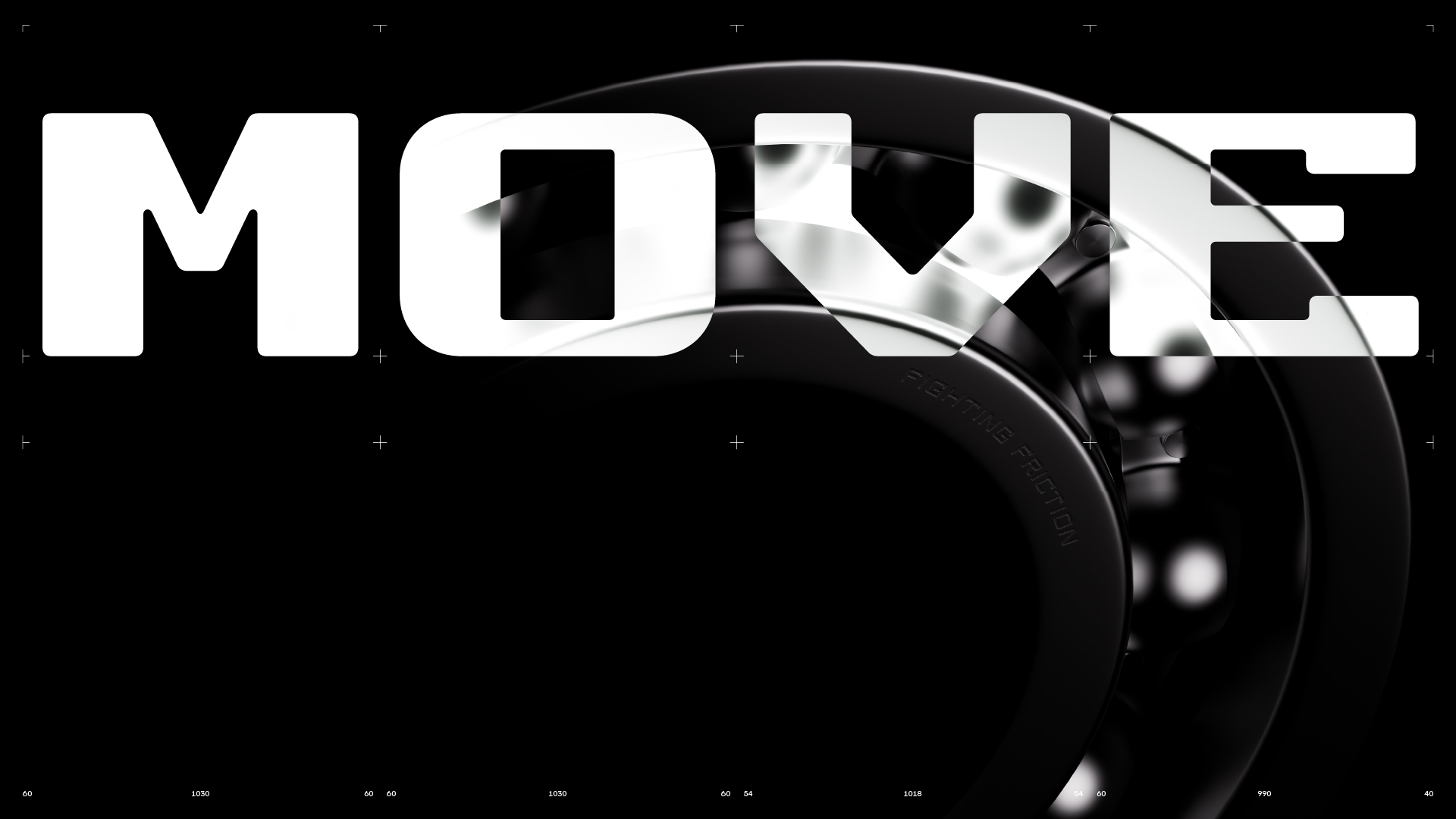
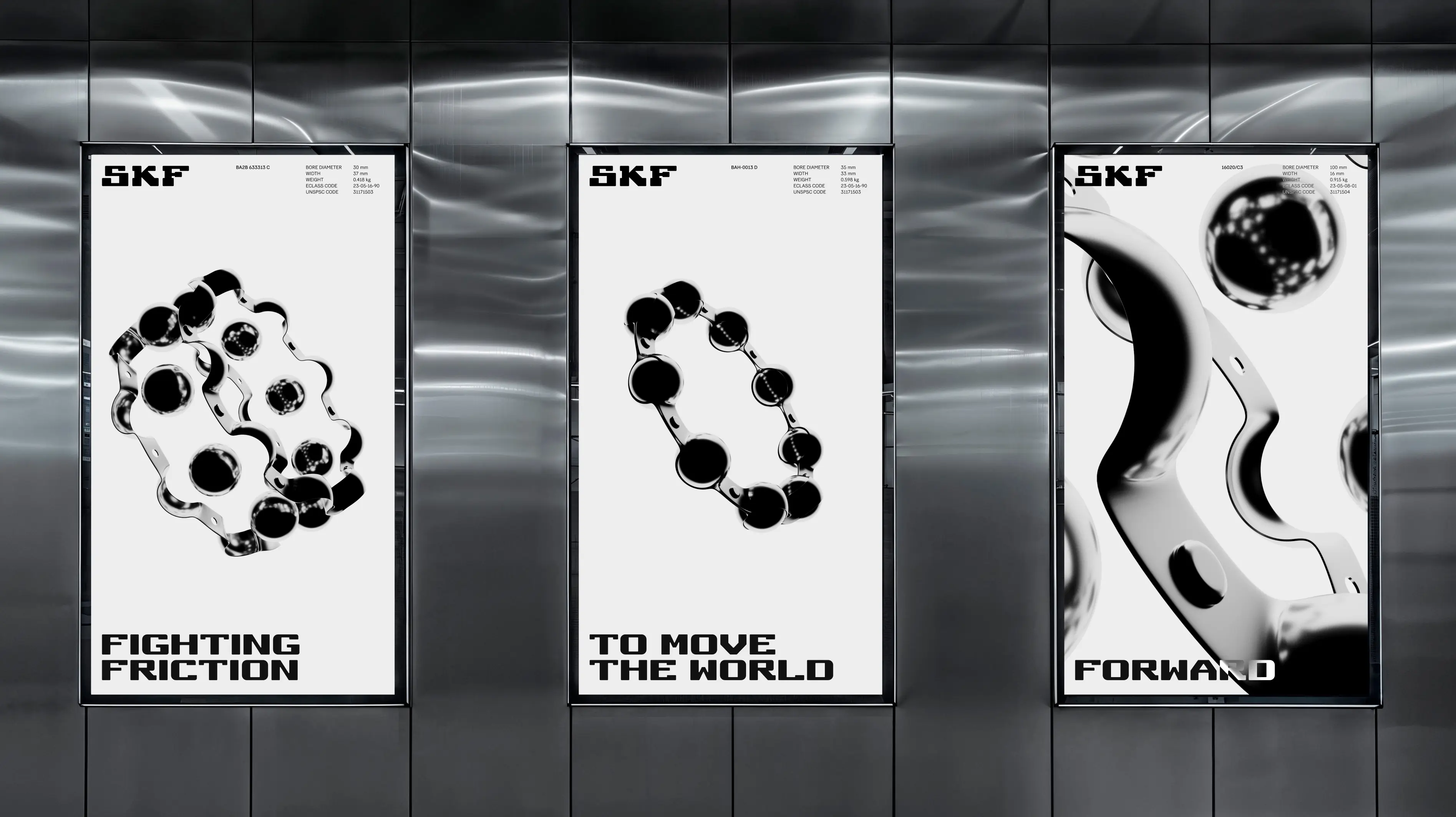
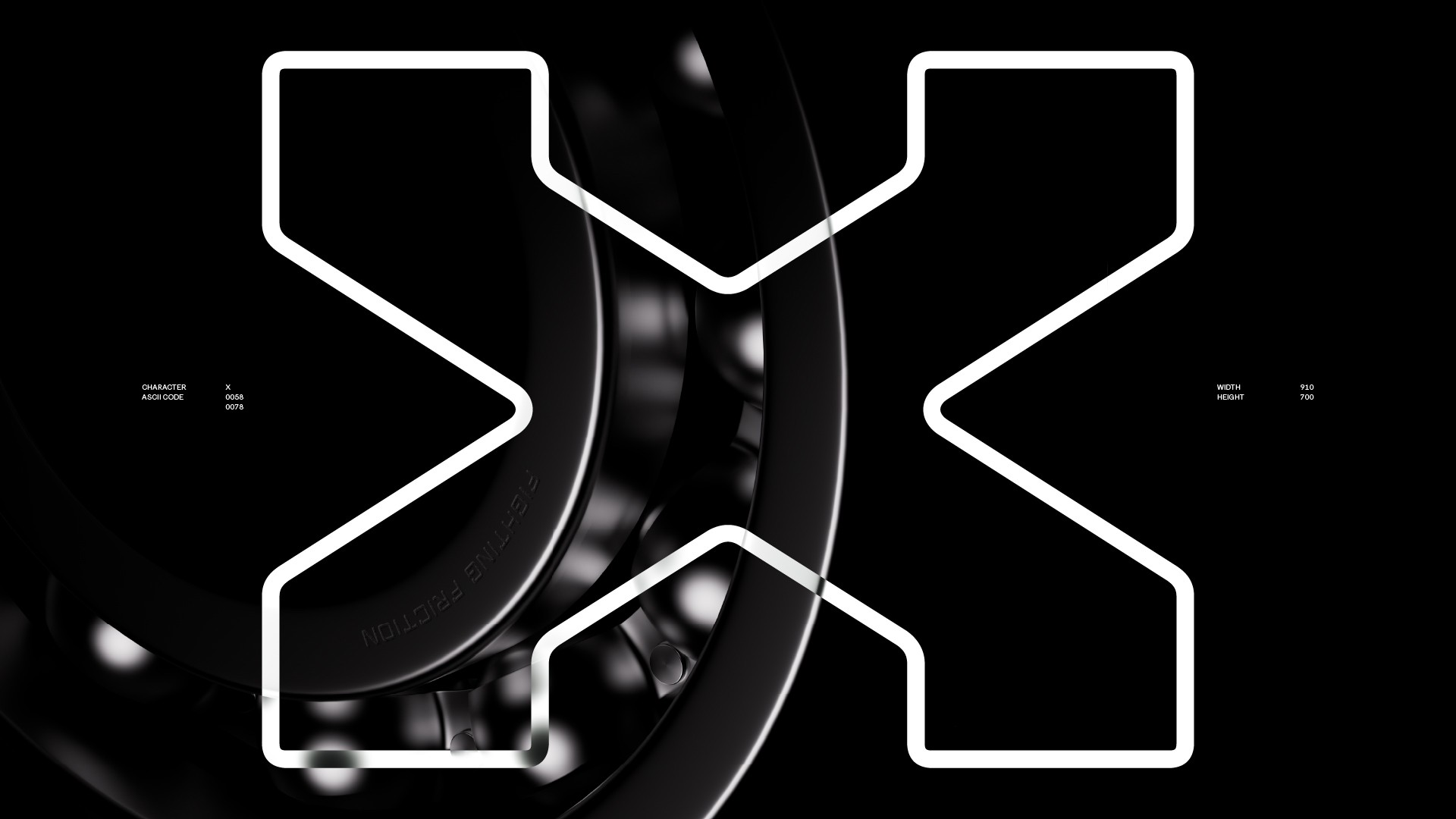
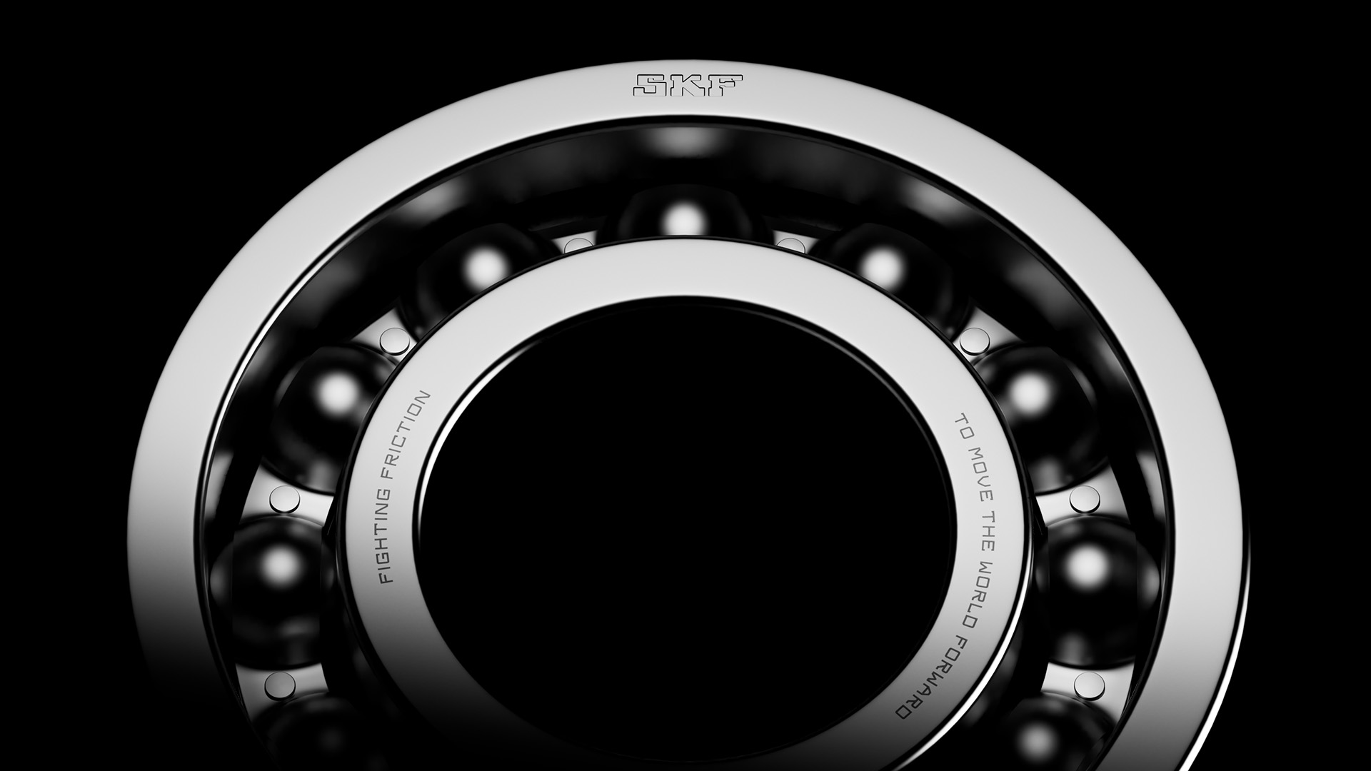
Fighting friction
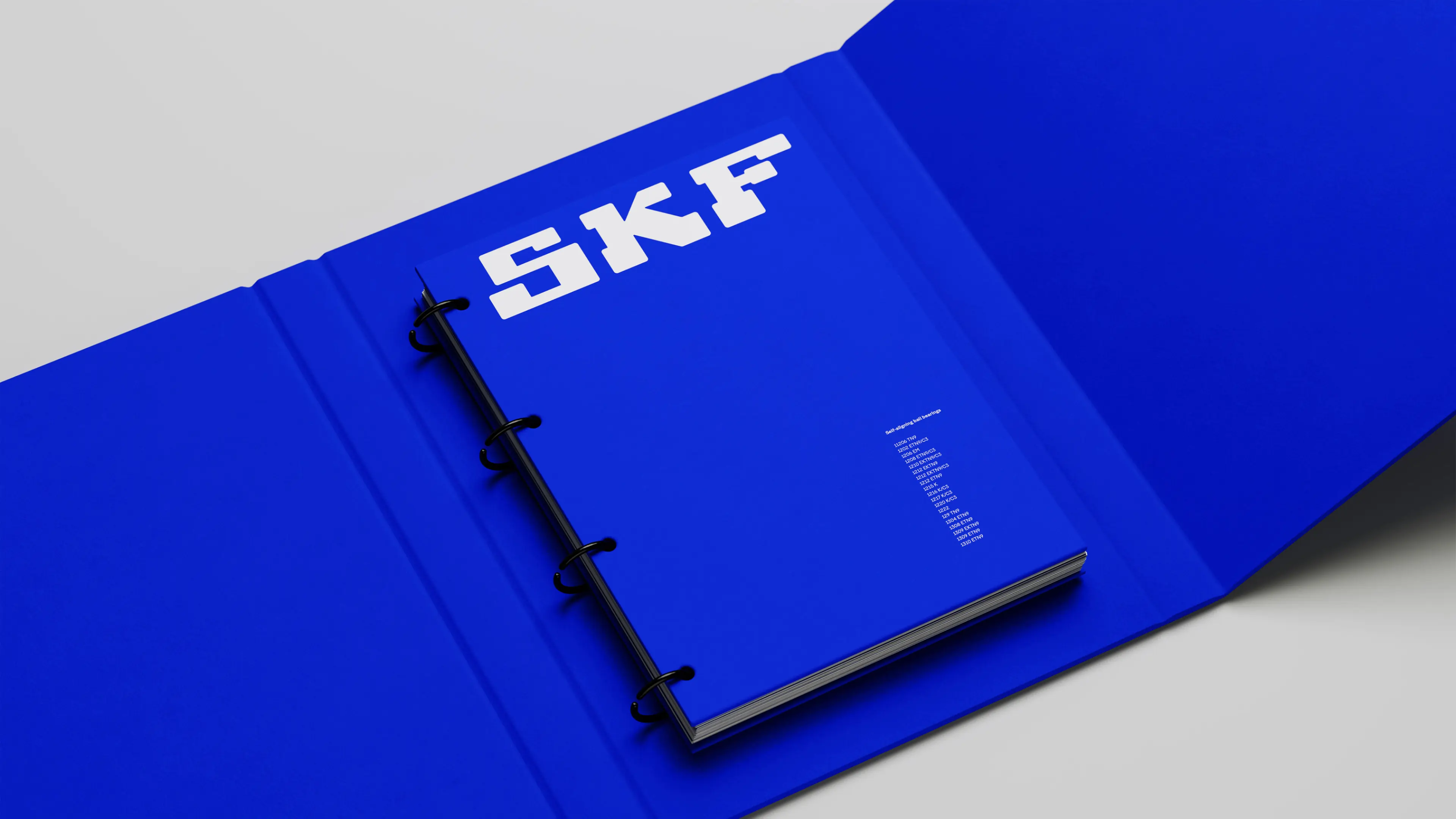
SKF
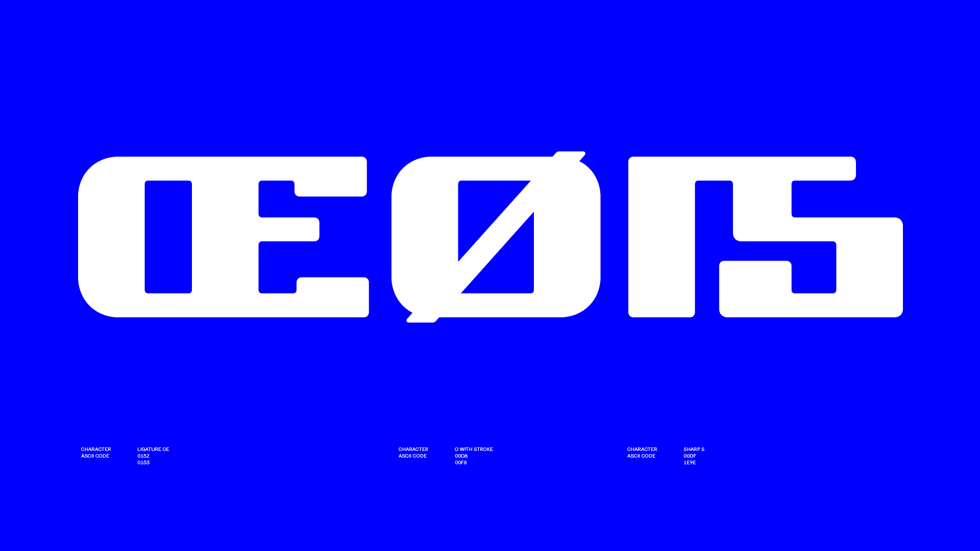
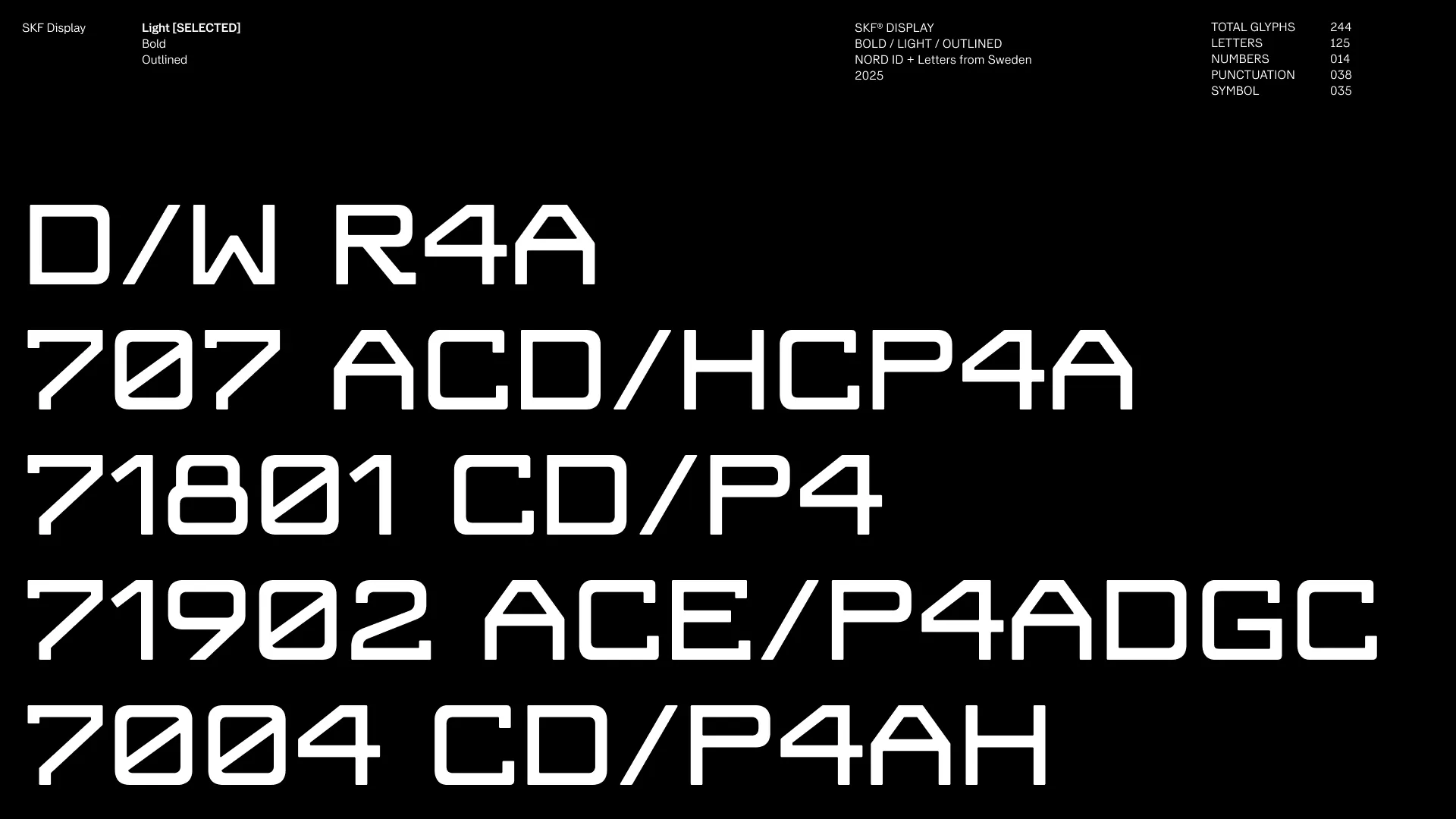
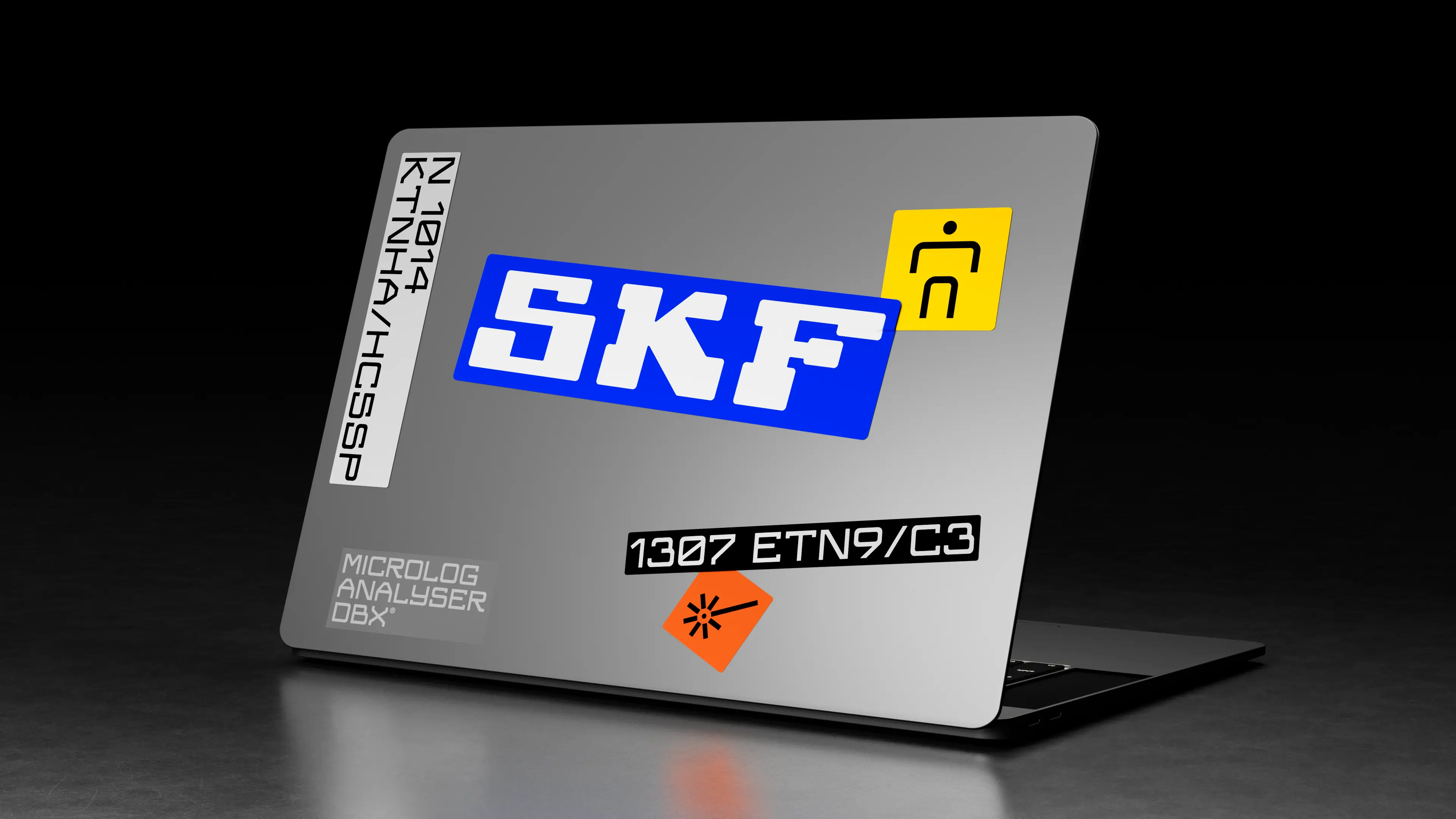
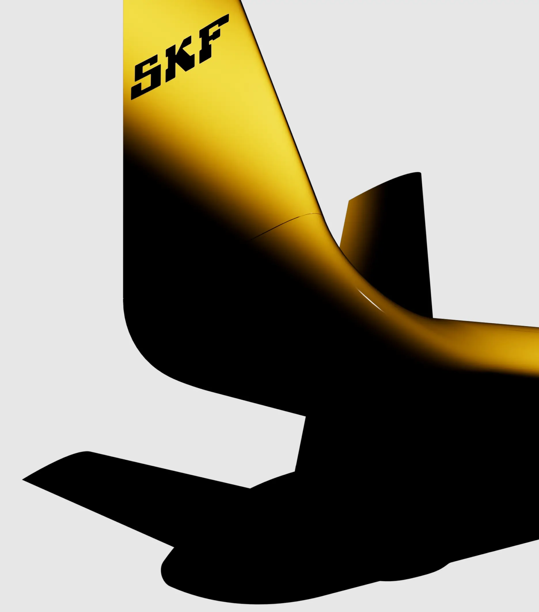
SKF, one of Sweden’s largest industrial companies, is updating its classic logo and brand. The distinctive 1908 logo is an icon both within its industry and in design circles. Its aesthetics inspire us, embodying modernity and progressiveness. With its timeless appeal, the logo remains as visionary and compelling today as it was 117 years ago. We made sure to carefully and lovingly refine and optimize it—without losing the character that makes it unique. We wanted to ensure that the heritage and strong personality that have endured for over 100 years would continue to thrive well into the future.